
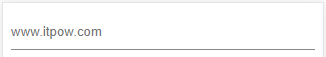
纯 CSS 实现,不需要 JS 和图片,效果截图如下:
代码:
<style type="text/css">
input
{
padding:0;
border:0;
width:100%;
height:40px;
background-image:linear-gradient(#f00,#f00),linear-gradient(#888,#888);
background-size:0 2px,100% 1px;
background-position:left bottom,center calc(100% - 1px);
background-repeat:no-repeat;
background-color:rgba(0,0,0,0);
outline:0;
}
input:focus
{
background-size:100% 2px,100% 1px;
transition:all .2s;
}
input:not(:focus)
{
background-size:0 2px,100% 1px;
transition:all .2s;
}
</style>
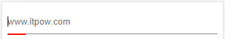
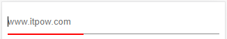
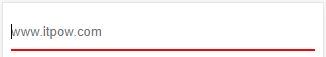
<input type="text" placeholder="用户名" />这里面 background 有几个属性有逗号,逗号前是 focus 响应的,逗号后是常规状态的。
而在 :focus 有一个 background-size 和 transition,这个是实现动态的关键。transition 第一个属性表示哪个 CSS 属性要响应,all 表示只要写的了,全部都响应(实际这里也只有一个 background-size),.2s 表示 0.2 秒。
CSS 中没有 :blur 这个伪类,所以我们用 :not(:focus) 中来实现 :blur,使离开时,也有动态效果。

